Snapcode (Take a screenshot)

solorioluis66
∴
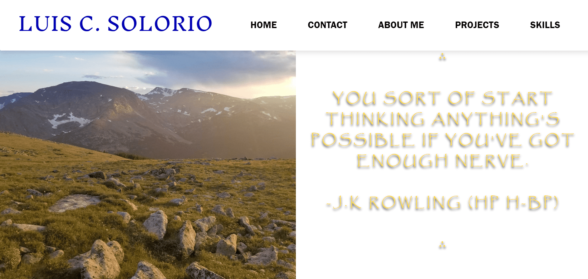
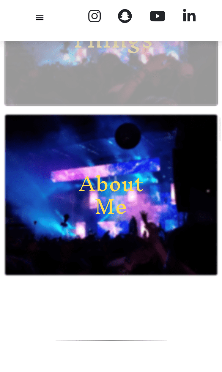
You sort of start thinking anything's possible if you've got enough nerve.
-J.K Rowling (HP H-BP)
∴

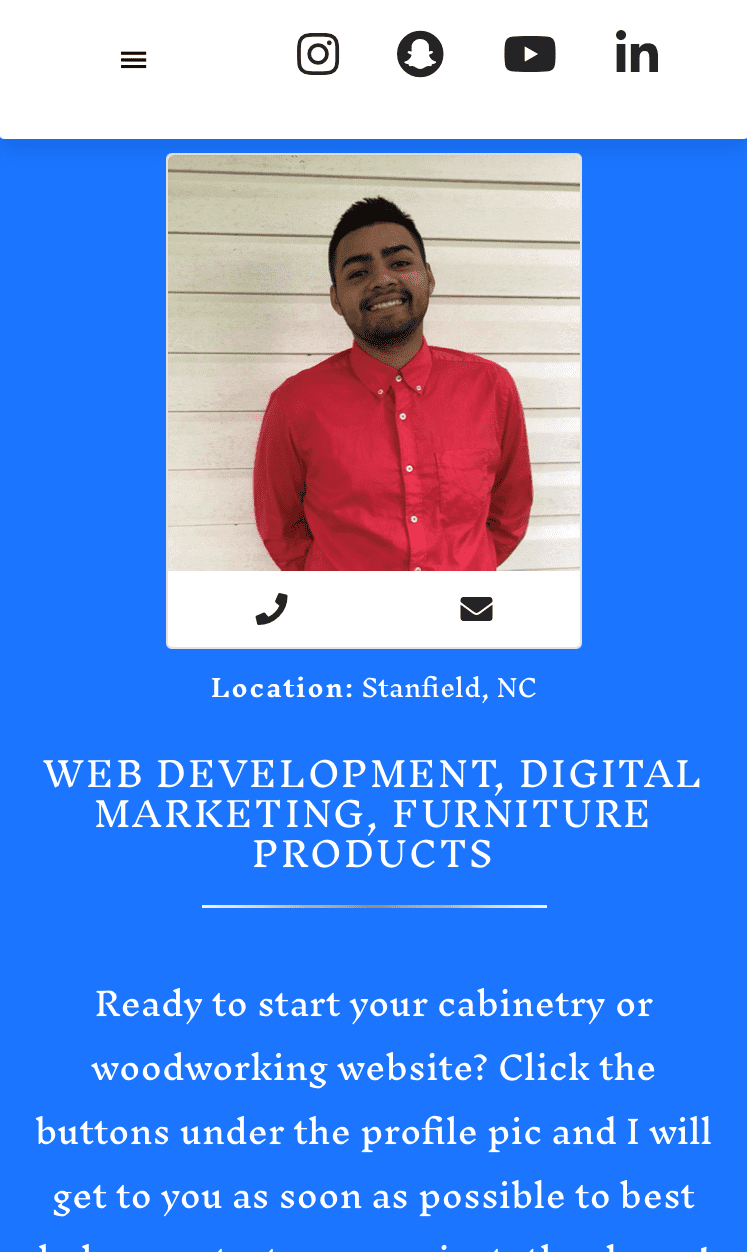
Web Development / Consulting, & Woodworking
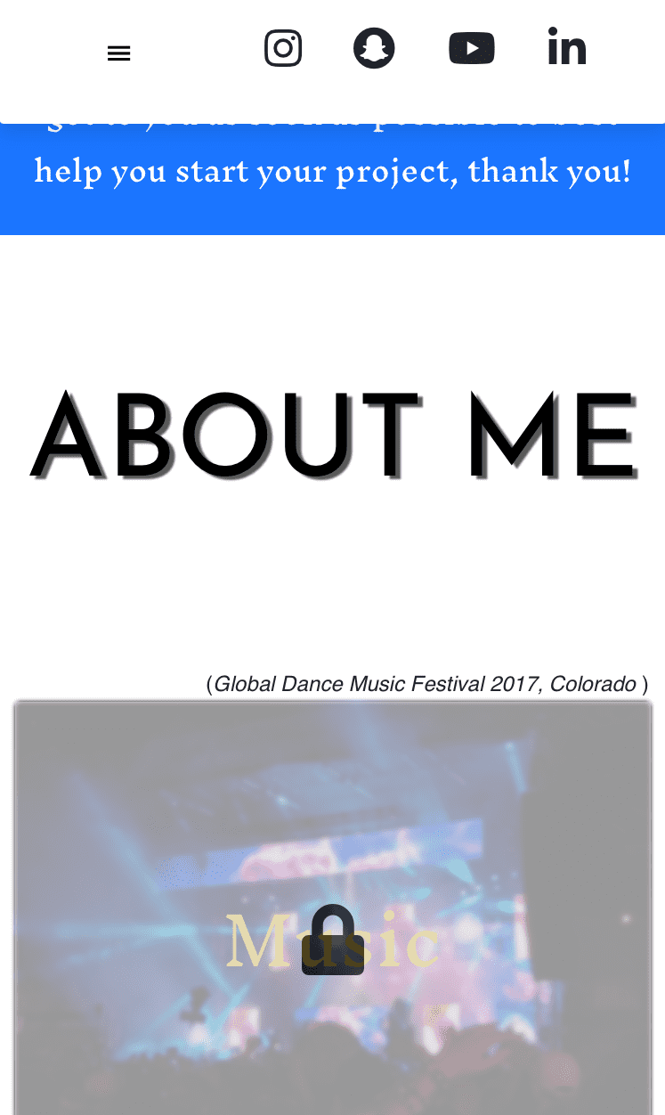
Helping small to medium sized cabinetry/woodworking businesses build a digital and profitable presence; Click the buttons under the profile pic and I will get to you as soon as possible to best help start your project, thank you! Hablo Español!
About Me
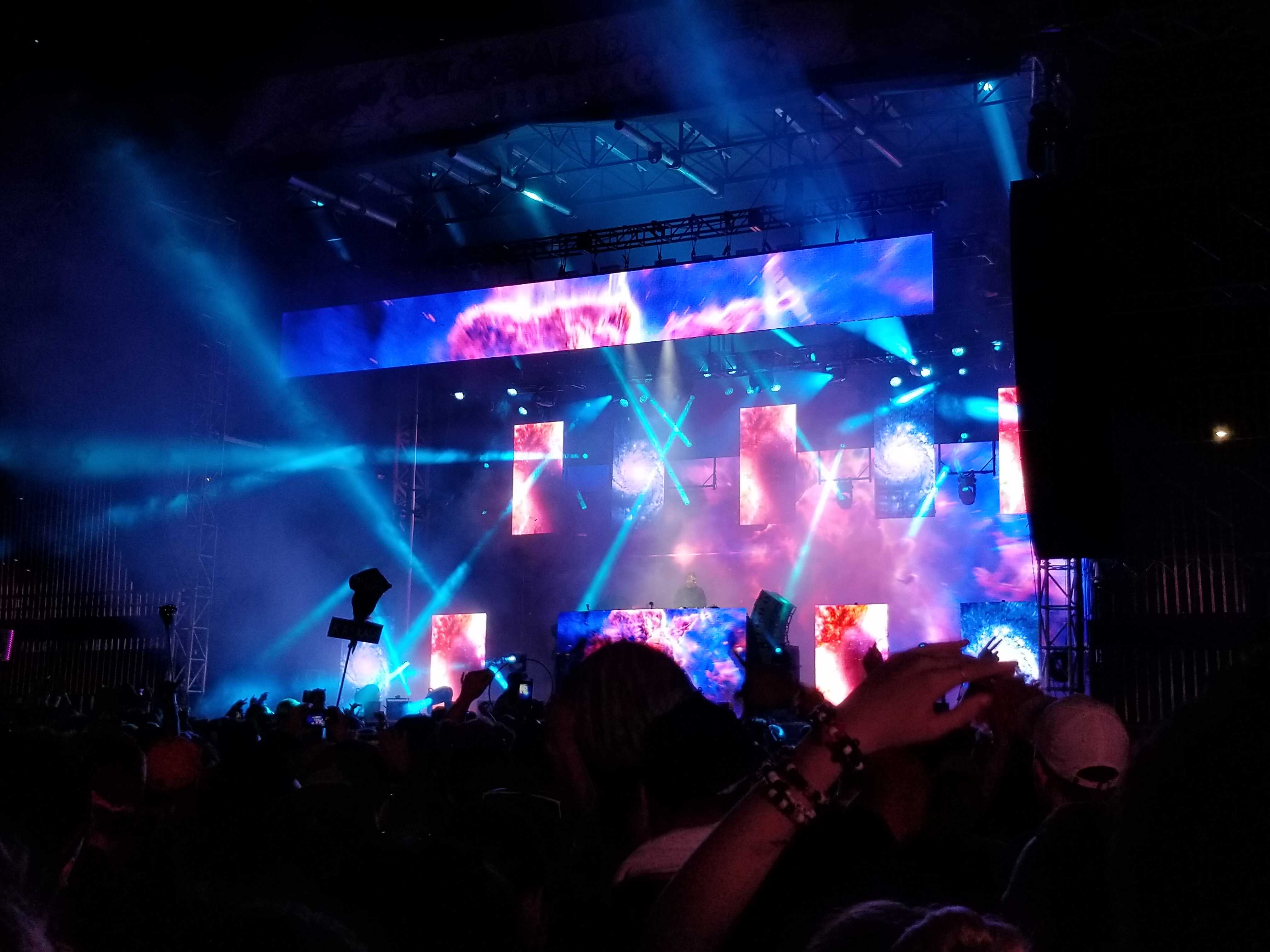
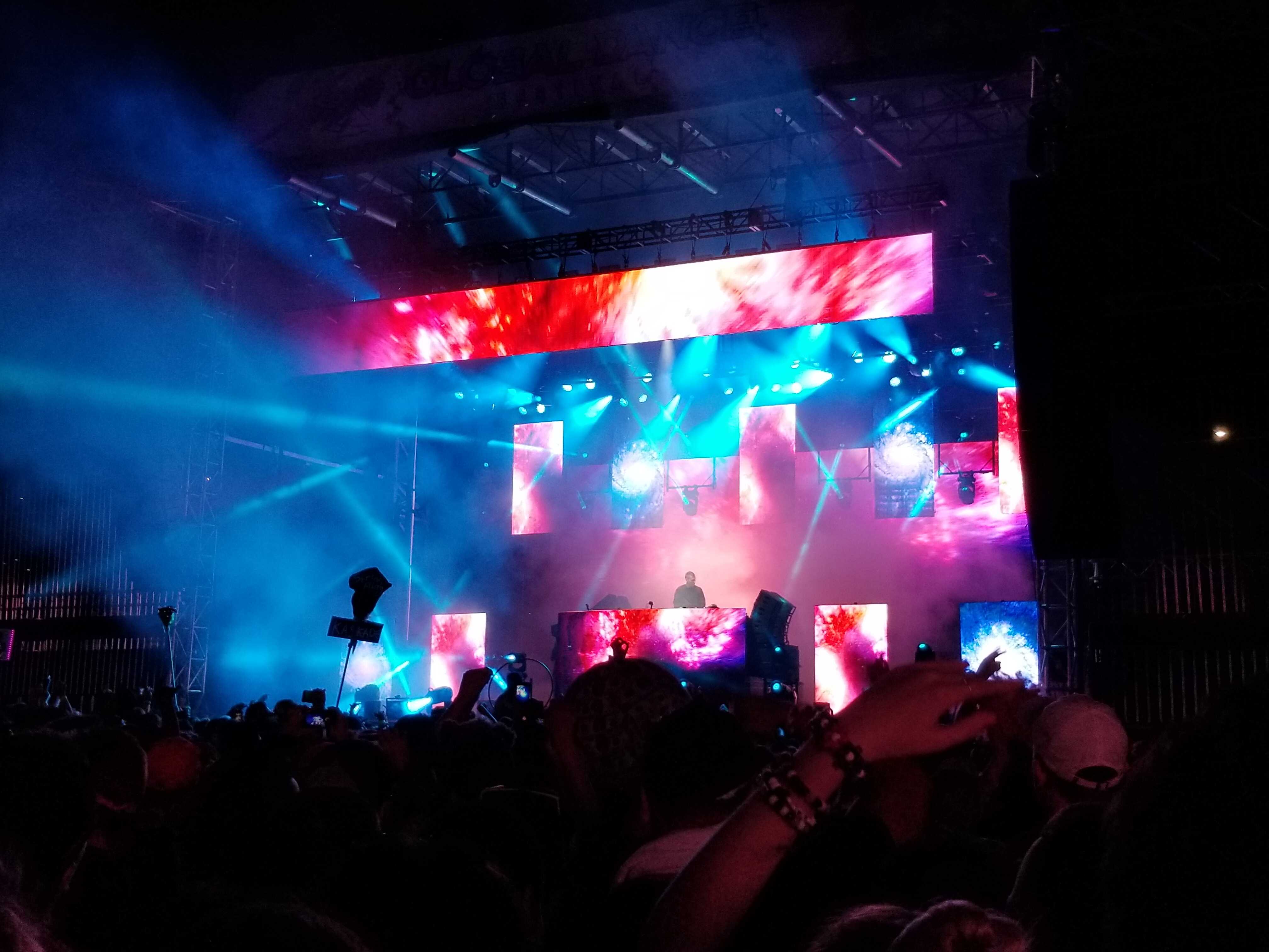
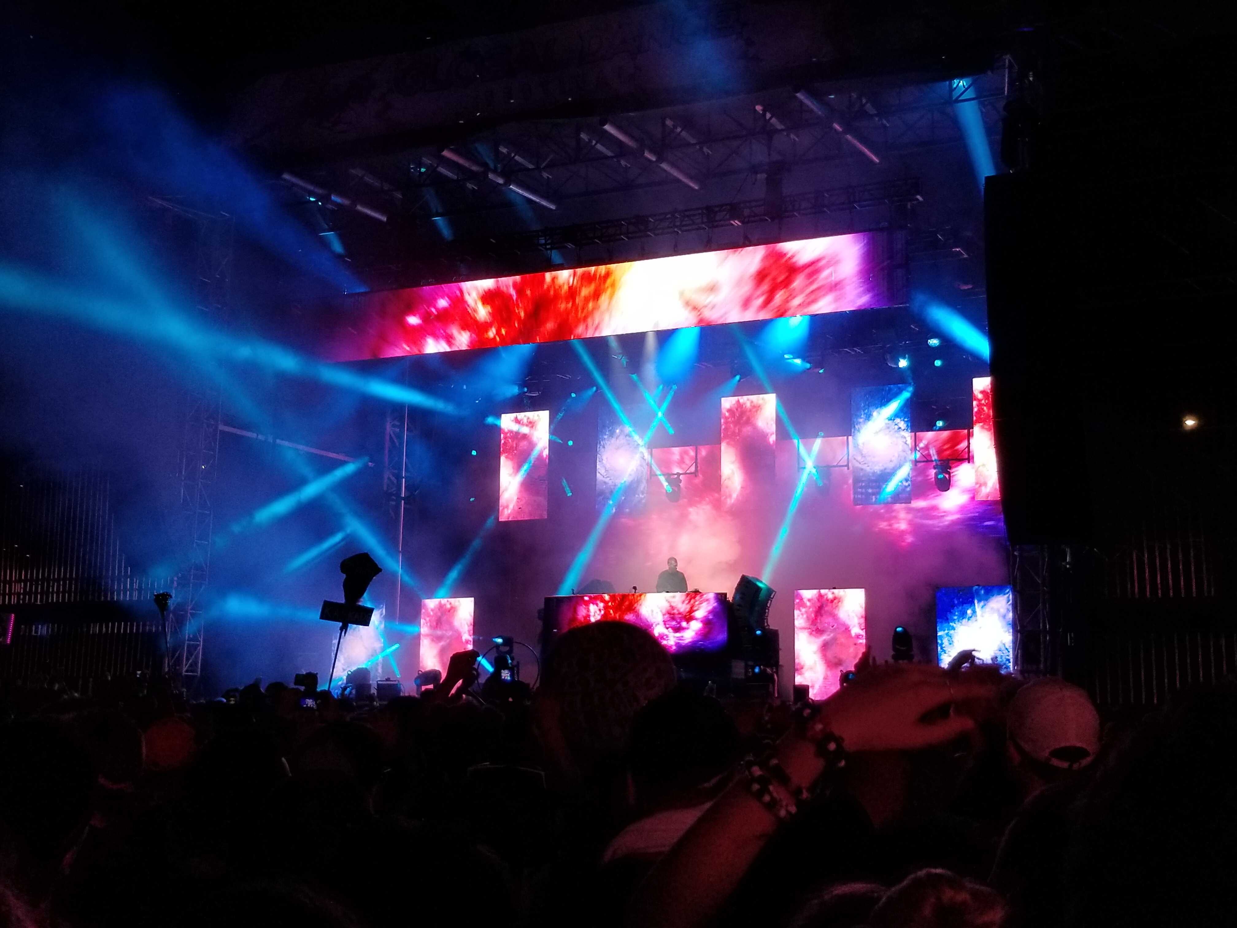
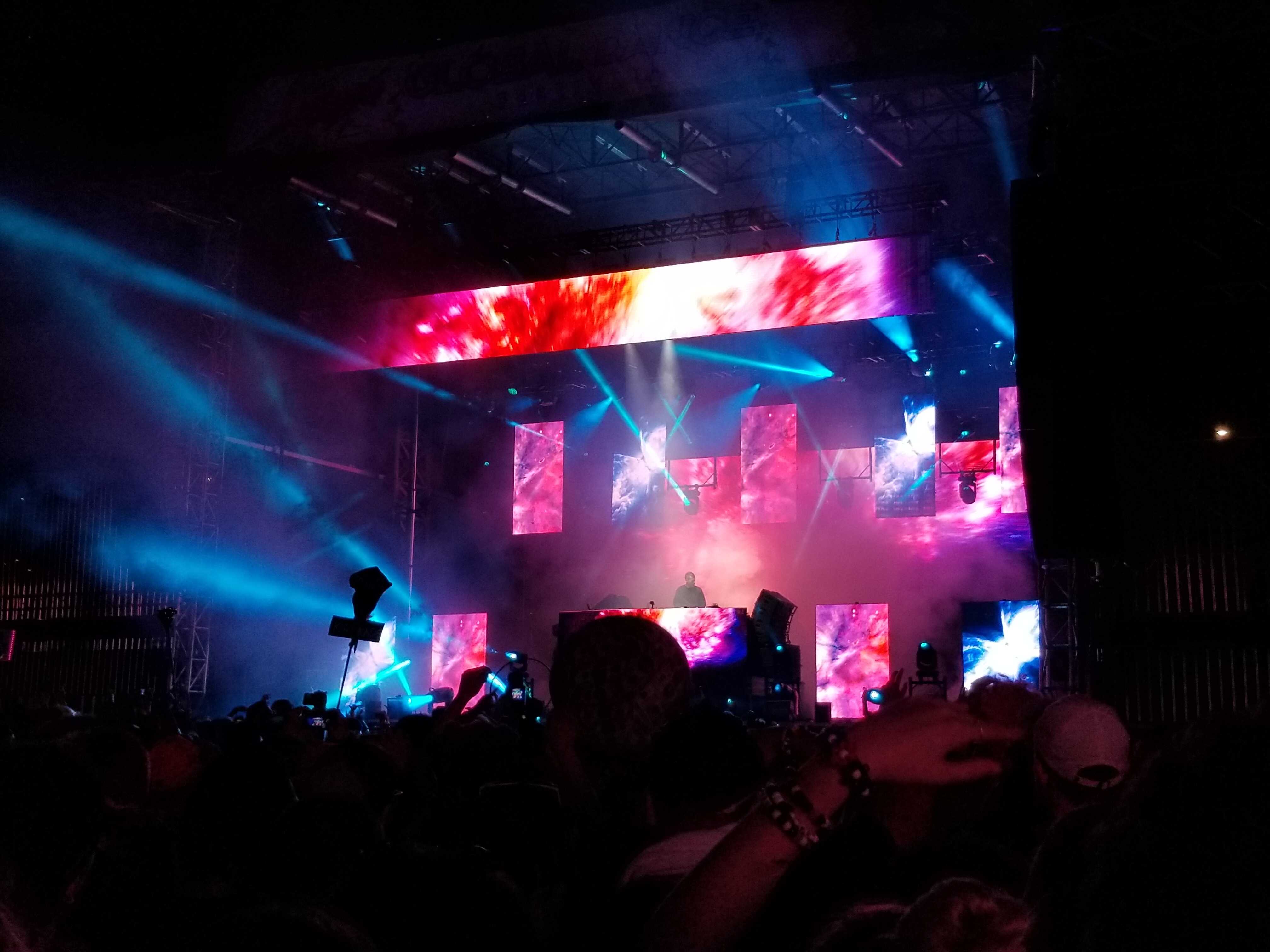
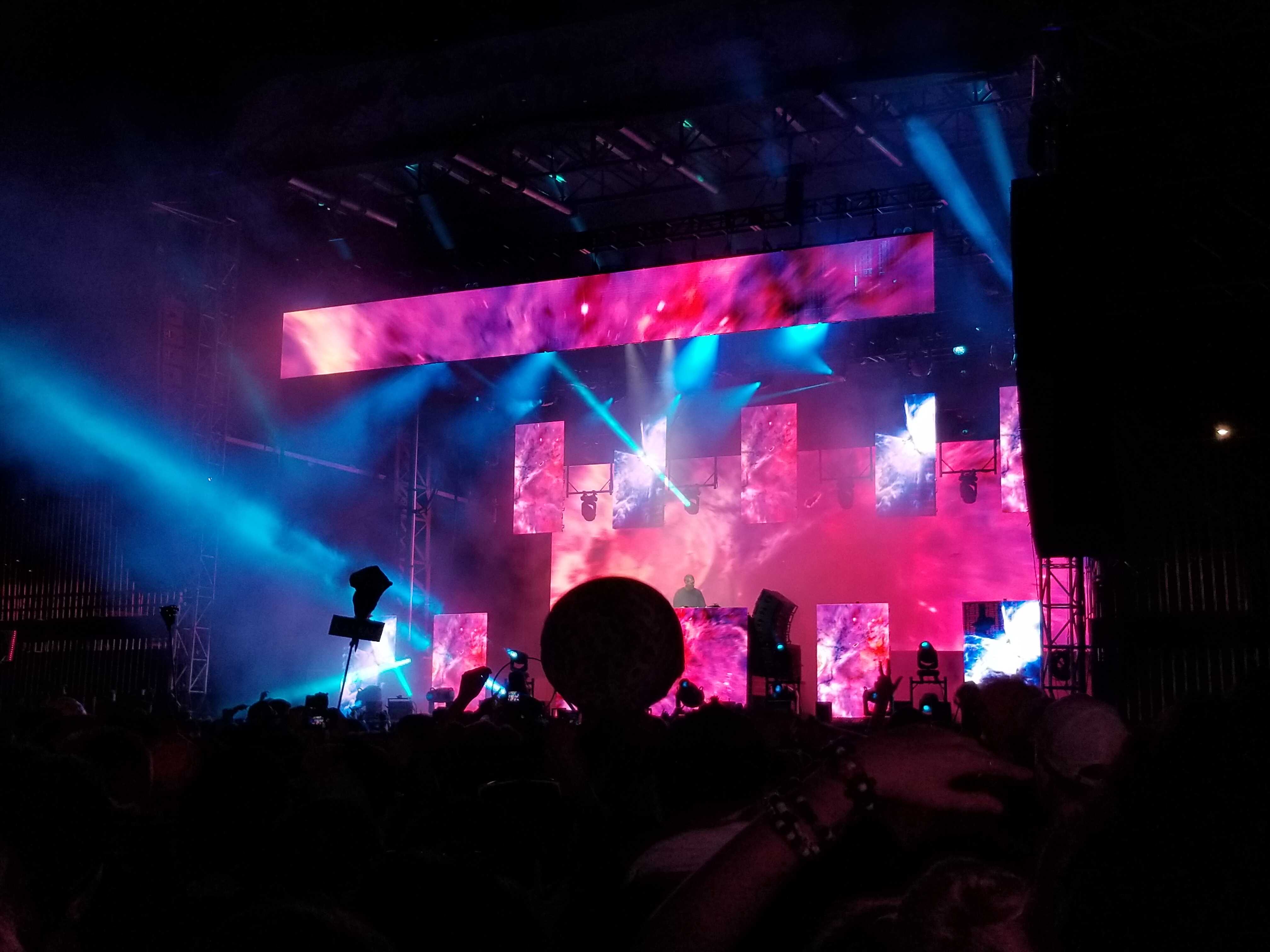
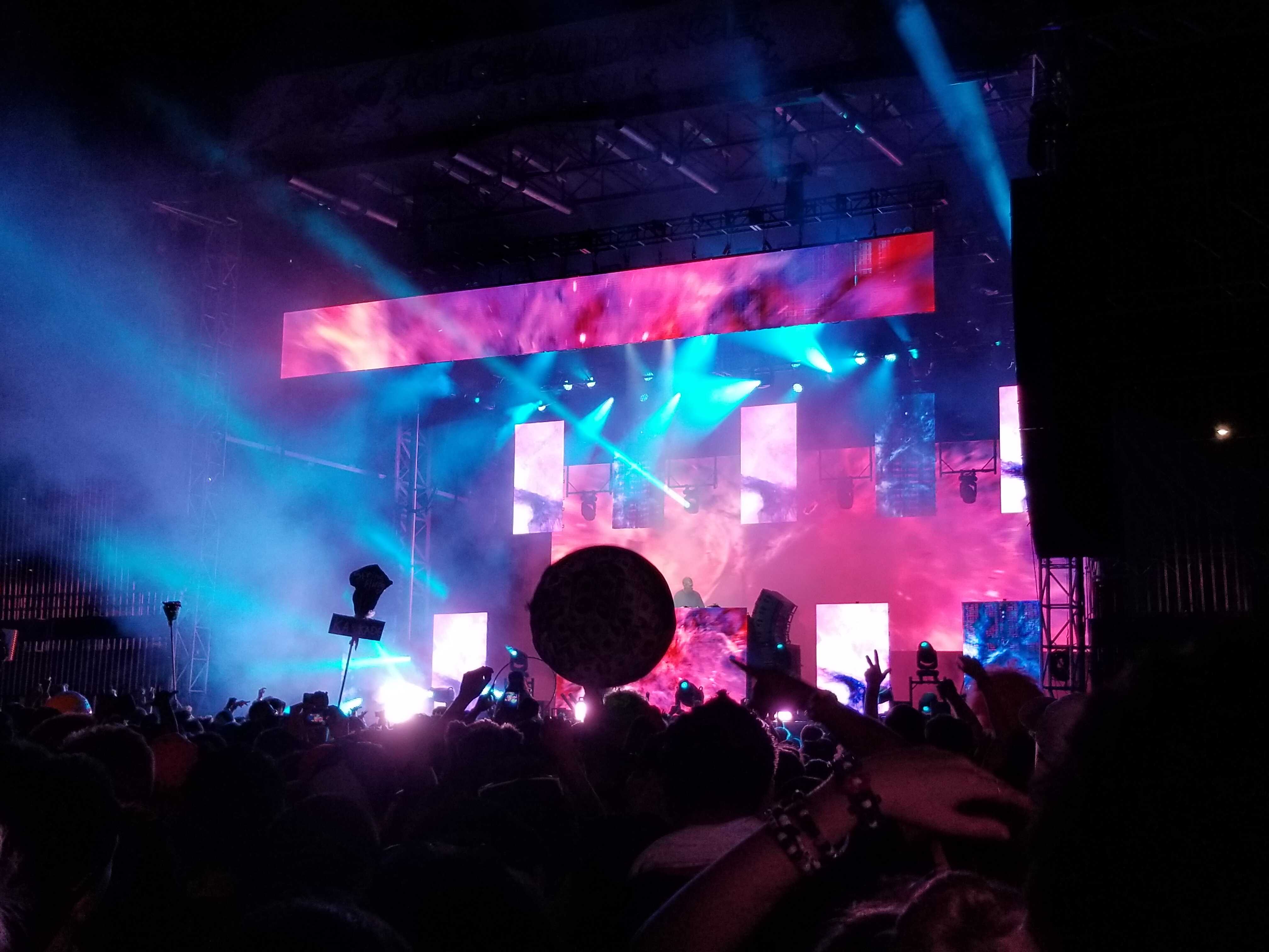
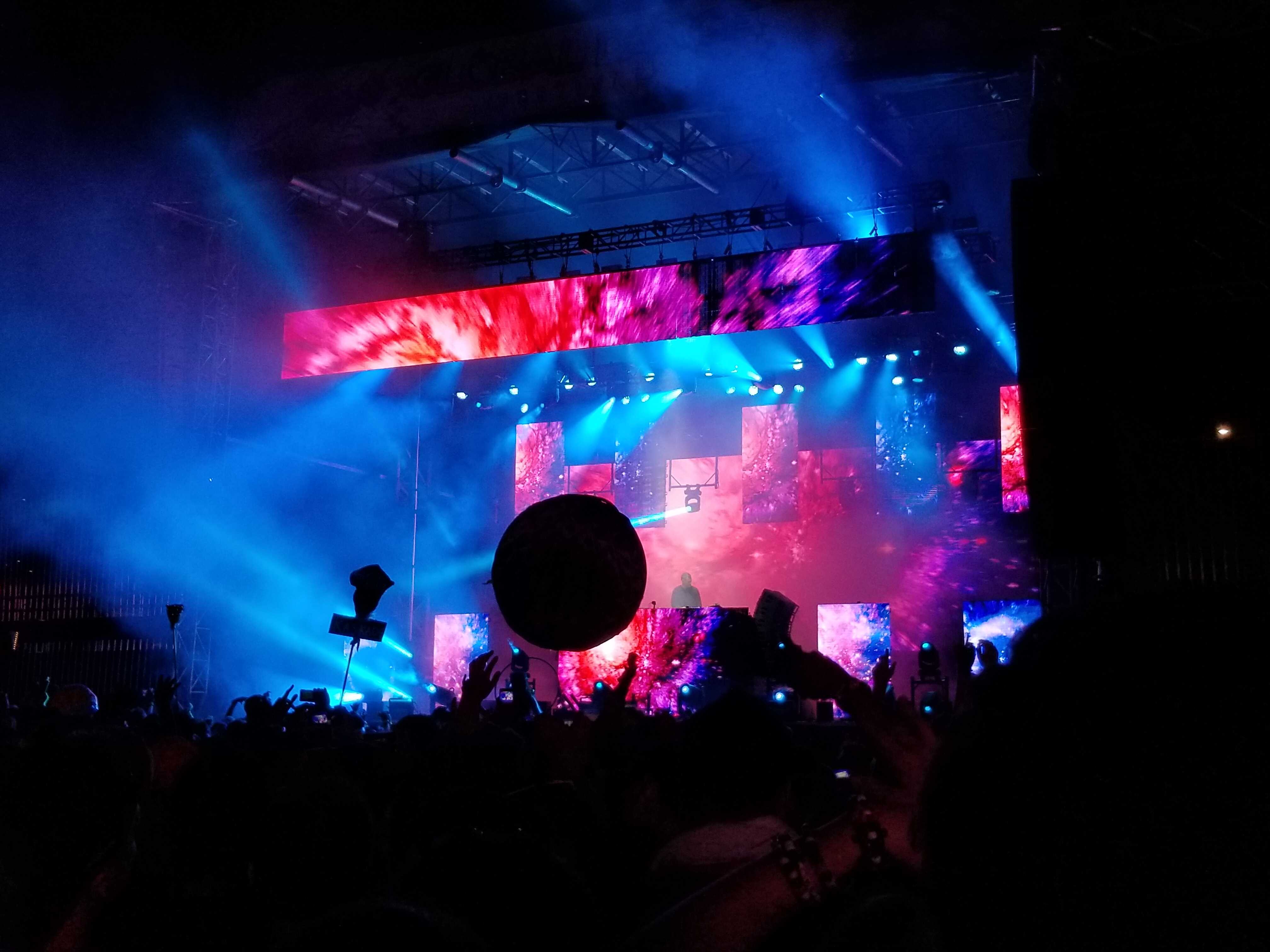
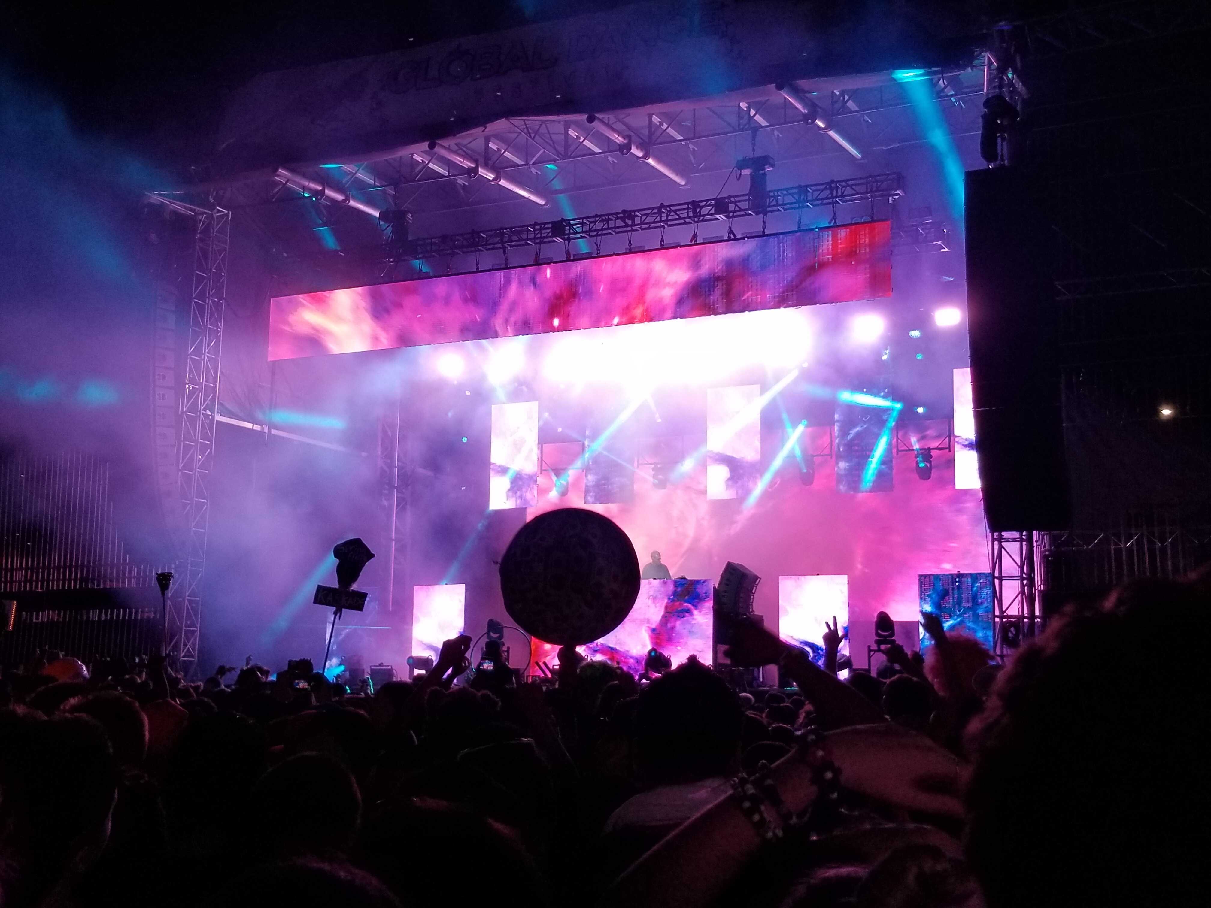
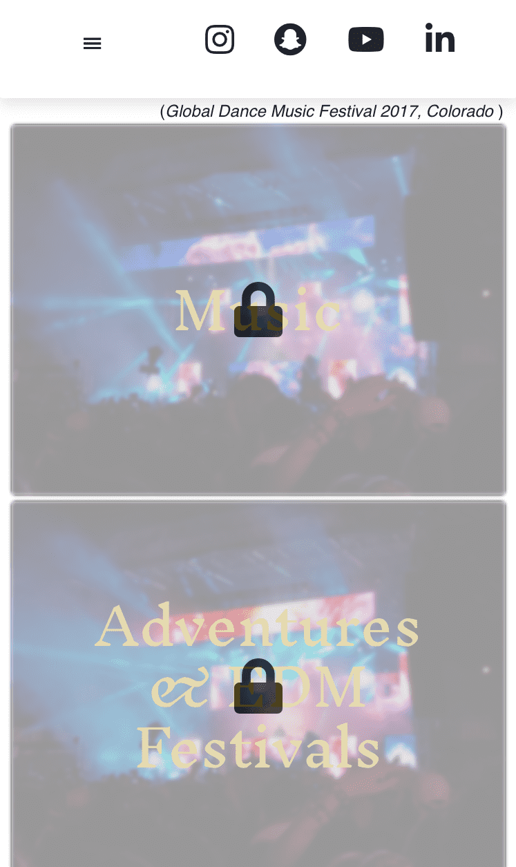
(Global Dance Music Festival 2017, Colorado - Hover Over)
_optimized.jpg)
_optimized.jpg)
_optimized.jpg)
_optimized.jpg)
_optimized.jpg)
Custom Desk Area

.jpg)
A Project created to show off my woodworking/finishing skills and form trust with future clients; a custom desk area for parents office/studio which features small things in case they have visitors, like a rod for clothes hangers and a dresser cabinet. The picture featured in this tab is only the rough draft for the finished product but was mainly used for its measurements. The outcome of the project is a multi-purpose desk, drop-zone style, with several elements including a dresser with panel additions to give it an "inset" look, an open bookcase cabinet with custom shelving, an open, clothe hanger storage, cabinet with holes for shelves, and another open cabinet for regular hanging shelves. Colors used are: Hale Navy (paint), Ebony (stain), and Snowbound White (paint.)
.jpg)
After drawings and gathering materials needed, the cutting process begins; this picture is just a representation of that.
.jpg)
Most of the project materials came from unused/extra pieces on other projects, just trying to recycle as much as I can. This pic is the finished bookcase cabinet with a custom shelve, pre-sanded.
.jpg)
This custom shelve was also meant to be a built-in and was therefore attached post-finishing and pre-installation. It was made using, banded, 3/4 plywood and attached to the base cabinet through the back.
.jpg)
The custom, open, base cabinet (post-sanding) that will carry the custom shelve made and which also has a custom frame made with 45° angles and legs.
.jpg)
All the items for the first phase including the stained top and kneespace.
.jpg)
The same items with a different angle.
.jpg)
Same items but with the custom shelve inside the base cabinet.
.jpg)
Shelve inside cabinet with a different angle.
.jpg)
The second phase of the drop zone is the wall cabinets with its backs that will later be attached after they're painted.
.jpg)
Wall cabinets up close on the curved header cut.
.jpg)
The main foundation of the project is installed with the four main sections painted and stained pre-installation. Also viewed is one of the panels and a custom desk piece for the center.
.jpg)
After the main foundation, came the smaller pieces, shelves and rod/rod support.
.jpg)
This is just the wooden rod stained ebony.
.jpg)
The crown molding was attached afterwards to the cabinets.
.jpg)
The hardware were the last pieces added before touch up; this is the final product for the dresser cabinet.
.jpg)
The final product for the open, hanger, top cabinet before touch up.
.jpg)
The final product for the custom, open-frame, bookcase cabinet before touch up.
.jpg)
Completed product for the shelving top cabinet on the drop zone.
.jpg)
The final project as a whole, including the kneespace, before the touch up process.
website:solluis.com
Woodworking Example 1
Thisected . que el blah blah blah. que el wiri wiri wiri. que el blah blah blah blah. que el wirir wiwoiw sffgfbfmgbfjbnjdfb dfvkjnfgbjnjkfg kfdjjfv kfvgjsf skifgv mnsfjnb
This is some wording about the image selected . que el blah blah blah. que el wiri wiri wiri. que el blah blah blah blah. que el wirir wiwoiw sffgfbfmgbfjbnjdfb dfvkjnfgbjnjkfg kfdjjfv kfvgjsf skifgv mnsfjnb
This is some wording about the h blah blah. que el wirir wiwoiw sffgfbfmgbfjbnjdfb dfvkjnfgbjnjkfg kfdjjfv kfvgjsf skifgv mnsfjnb
This is some wording about the image selected . que el blah blah blah. que el wiri wiri wiri. que el blah blah blah blah. que el wirir wiwoiw sffgfbfmgbfjbnjdfb dfvkjnfgbjnjkfg kfdjjfv kfvgjsf skifgv mnsfjnb
This is some wording about the image selected . que el blah blah blah. que el wiri wiri wiri. que el blah blah blah
This is some wording about the image selected . que el blah blah blah. que el wiri wiri wiri. que el blah blah blah blah. que el wirir wiwoiw sffgfbfmgbfjbnjdfb dfvkjnfgbjnjkfg kfdjjfv kfvgjsf skifgv mnsfjnb
This is jjfv kfvgjsf skifgv mnsfjnb
Thie el blah blah blah blah. que el wirir wiwoiw sffgfbfmgbfjbnjdfb dfvkjnfgbjnjkfg kfdjjfv kfvgjsf skifgv mnsfjnb
Woodworking Example 2
Thisected . que el blah blah blah. que el wiri wiri wiri. que el blah blah blah blah. que el wirir wiwoiw sffgfbfmgbfjbnjdfb dfvkjnfgbjnjkfg kfdjjfv kfvgjsf skifgv mnsfjnb
This is some wording about the image selected . que el blah blah blah. que el wiri wiri wiri. que el blah blah blah blah. que el wirir wiwoiw sffgfbfmgbfjbnjdfb dfvkjnfgbjnjkfg kfdjjfv kfvgjsf skifgv mnsfjnb
This is some wording about the h blah blah. que el wirir wiwoiw sffgfbfmgbfjbnjdfb dfvkjnfgbjnjkfg kfdjjfv kfvgjsf skifgv mnsfjnb
This is some wording about the image selected . que el blah blah blah. que el wiri wiri wiri. que el blah blah blah blah. que el wirir wiwoiw sffgfbfmgbfjbnjdfb dfvkjnfgbjnjkfg kfdjjfv kfvgjsf skifgv mnsfjnb
This is some wording about the image selected . que el blah blah blah. que el wiri wiri wiri. que el blah blah blah
This is some wording about the image selected . que el blah blah blah. que el wiri wiri wiri. que el blah blah blah blah. que el wirir wiwoiw sffgfbfmgbfjbnjdfb dfvkjnfgbjnjkfg kfdjjfv kfvgjsf skifgv mnsfjnb
This is jjfv kfvgjsf skifgv mnsfjnb
Thie el blah blah blah blah. que el wirir wiwoiw sffgfbfmgbfjbnjdfb dfvkjnfgbjnjkfg kfdjjfv kfvgjsf skifgv mnsfjnb
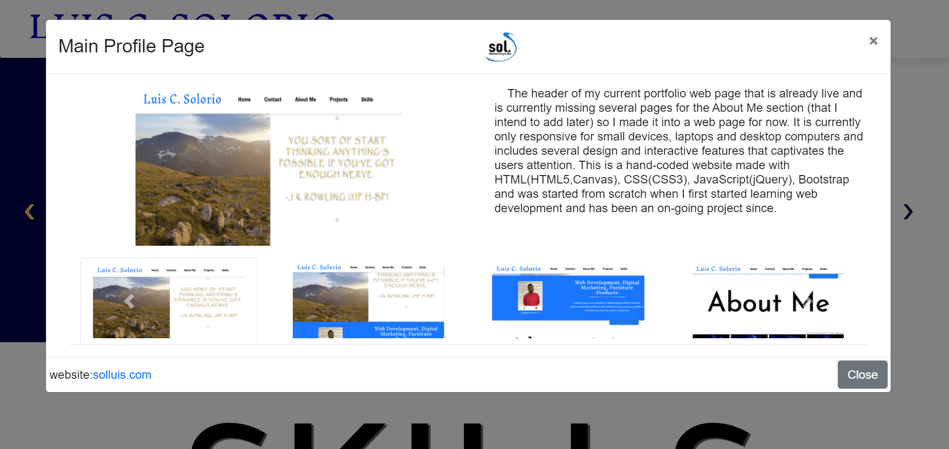
Main Profile Page
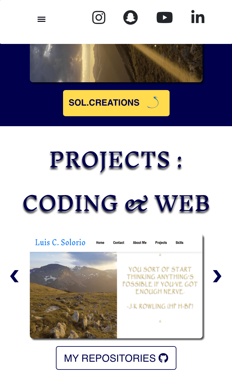
The header of my current portfolio web page which is already live and is currently missing several pages for the About Me section (that I intend to add later) so I made it into a web page for now. It is currently only responsive for small devices, laptops and desktop computers. It includes several design, interactive and call-to-action features that captivates the users attention. This is a hand-coded website made with HTML(HTML5,Canvas), CSS(CSS3), JavaScript(jQuery), & Bootstrap. It was started from scratch when I first started learning web development and has been an on-going project since.
_optimized.png)
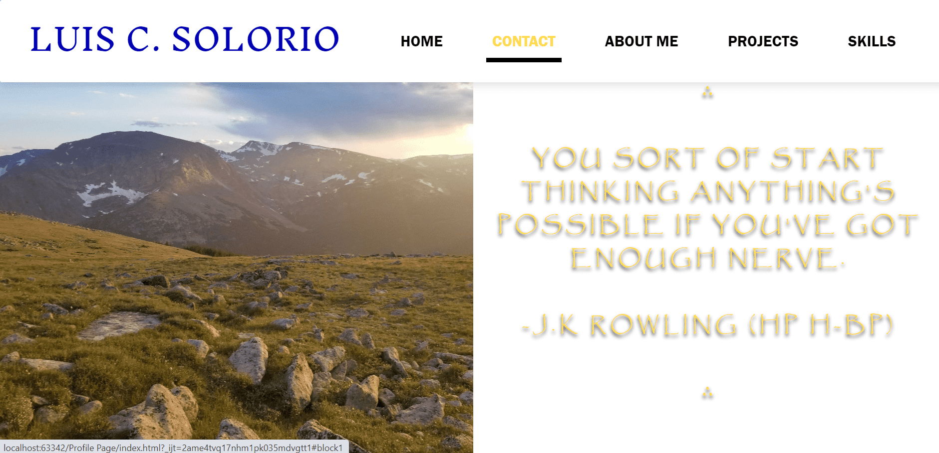
A responsive, Bootstrap nav bar that includes hover effects for the nav items, a smooth, navigation transition on each nav item click, and also, for desktop view, a change of height for the nav bar that fires when you scroll down. The banner is a 2-column split that hides the left side(Colorado view) on small devices but has a parallax feature on desktop view. The right side is just a quote from one of my favorite books. I intend to upgrade this in the future to a quote that changes either daily or weekly with javaScript or jQuery.
_optimized.png)
Contact section is a simple, 2-column split with a Bootstrap card(profile picture) on the left side and 2 contact buttons underneath. A right side that fires when scrolled into view using JavaScript with fade-in features made with CSS.
_optimized.png)
The first section header that fires when scrolled into view using JavaScript.
_optimized.png)
An About Me section that I plan to add more pages and info to and styled as a responsive image grid via CSS. It has a hover feature on laptops and desktop computers and permanently on small devices.
_optimized.png)
Hover feature for the About Me section.
_optimized.png)
A horizontal rule that splits the About Me and Projects sections and is styled with a gradient grey using CSS.
_optimized.png)
The main part of the projects section which contains an image carousel that opens up a modal, image gallery on click for both desktop and small device views. The section also contains some small, call-to-action buttons for a future online store that I'm currently working on, via WordPress and its WooCommerce plugin, and for my github page where I have most of my past coding projects and more. It's split into 2 columns using Bootstrap.
The Projects section modals include a customized, advanced, Bootstrap, carousel that shows 5 items at once on desktop view and which are, also, connected to the tab panes on the top part of the modals and so are used as dynamic tabs. The modals are also customized to show the logo I created.
_optimized.png)
The second section header that fires when scrolled into view using JavaScript.
_optimized.png)
The Skills section is subject to change for a simpler service approach but is currently made from: 5 columns & 2 rows out of Bootstrap, multiple call-to-actions, several progress circles using Canvas and CSS width bars.
_optimized.png)
The bottom part of the skills section, which features two buttons with a hover feature.
_optimized.png)
Hover feature on skills section buttons.
_optimized.png)
The page footer featuring several hover features and customized tooltip hover features for the social media buttons.
_optimized.png)
Footer section hover for social media buttons.
_optimized.png)
Nav item hover feature.
Nav item hover feature.
Responsive view of Web page header which features a sticky, Bootstrap nav and its social media buttons the Colorado image is hidden in this view.
The nav bar opened to show the nav items which are customized to show a smooth scroll to its specified location within the web page using JavaScript. The nav bar itself is also customized a bit, just to close itself after each nav item click and, also, anywhere but the nav bar.
The responsive view for the Contact section.
The responsive view of the About Me header.
Responsive, About Me image buttons with overlays using CSS.
Responsive, About Me image buttons with overlays using CSS.
Responsive, About Me image buttons with overlays using CSS.
Responsive, About Me image buttons with overlays using CSS.
Responsive, About Me image buttons with overlays using CSS.
Responsive, About Me image buttons with overlays using CSS and the horizontal rule.
Responsive view of the Projects section for the woodworking area.
Responsive view of the projects section for the coding & web area.
The responsive view of the project modals that fire on click for the carousel items. The tab panes are hidden in this view and just shows the carousel items.
Skills Section header in responsive view.
The HTML area in the skills section on responsive view.
The Style & Design area in the skills section on responsive view.
The Responsive area in the skills section on responsive view.
The JavaScript area in the skills section on responsive view.
The Other Programming area in the skills section on responsive view.
The Desktop Applications & Other Tools area in the skills section on responsive view.
The Woodworking area in the skills section on responsive view.
The Soccer Officiating area in the skills section on responsive view.
The Wood Spraying area in the skills section on responsive view.
The Others area in the skills section on responsive view.
The footer section of the web page in responsive view. The menu and social media buttons are hidden.
website:solluis.com
sol. Logo
First professional logo, created with Adobe Photoshop, Illustrator, and a drawing by hand. The thought process was an ongoing train of thought and, therefore, several ideas played key roles in the design aspect including the name of company and the shape of the "S". "Sol", is the first three letters of my last name and, also, means "sun" in Spanish, for which I hope the company will shine a light on this negative world & why the custom "S" is fitted around a circle. 3 main concepts were compiled in creating the custom "S", with the letter of the alphabet being the obvious one, second is the ying yang symbol which represents the double trade in the company and is a favorite meaning of mine. Lastly, the shape just reminds of when we played marbles with the brothers as a kid and that created the initial thought of this logo.
This is a second variation of the logo which shortens the services into an acronym that resembles "www" , as web services are part of the company. This is just a prototype and will not be used.
The third variation of the logo is only the custom "S" that was created from the drawing and was then cut out using Photoshop and digitized. For now, it is only being used as the favicon for the companies website and future websites.
Hand drawings of how the custom "S" for the logos came about.
website:solluis.com
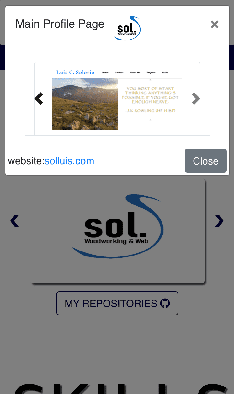
Bootstrap Profile Page
.jpg)
A project created to advance skills in Bootstrap 4 and the grid system, Bootstrap & CSS. This, a full-screen web page that uses Bootstraps Dynamic Tabs to navigate the body on the right side of the column split while keeping the left fixed; This web page is not responsive on smaller devices. The fixed section contains a profile pic, Bootstrap, card with contact buttons & underneath it is some info about me that also stays fixed. About Me tab contains a top, single, column with a 3-column split on bottom and some random quotes inside. Web page also consists of nav and footer sections, with appropriate column splits, and inside, a main social nav bar, social nav bar, couple of links, and space for logo.
.jpg)
Services & Skills tab contains 2-column containers with services and skills info that is bullet-styled & call-to-action buttons at the end.
.jpg)
Projects tab is a container card that can be flipped for the back side, using jQuery. Each card contains a 2-column split with an automatic gallery playing on the left & on right side, a heading, call-to-action button, and the jQuery button transition that was also made with CSS for part of the transition.
.jpg)
Back side of the Projects tab card that was flipped with the jQuery button. Contains the same content as the front side with a change of galleries and projects.
.jpg)
Contact tab contains a heading at the top & a 2-column split with 2 small containers, as contact buttons, at the bottom using icons and links.
website:solluis.com
WordPress/XAMPP/Bootstrap
.jpg)
Project to advance my skills in WordPress, Bootstrap and local hosting with XAMPP app. Other objectives were to create a custom-theme WordPress site from scratch using a pre-made, Bootstrap theme and to change up a couple of things to make the web page "my own." Also added a fixed social nav bar that switches up in responsive views. The header consists of a, full-width, hero banner, navigation bar up top, call-to-action, and the fixed, social nav bar.
.jpg)
About section contains 2 headings for double services and a call-to-action button at the bottom.
.jpg)
Services area is made up of a 4-column section with headings and icons that match the services.
.jpg)
First section of the portfolio segment includes a grid gallery on three columns with hover effects on each item.
.jpg)
Middle section of the Portfolio segment includes a call-to-action button and some gallery descriptions that are positioned accordingly. Third section of the Portfolio segment is the epitome of the first section, so, did not include in gallery.
.jpg)
The Contact segment includes a simple heading with contact buttons, that also come with icons, underneath that are on a 2-column split. As shown, the social nav bar stops perfectly at the footer.
.png)
This web page is also viewable on small devices with no major changes to the layout aside from the position of the fixed, social nav bar and the main nav bar collapsing since it is a Bootstrap nav.
.png)
This web page is also viewable on tablet devices with no major changes to the layout aside from the position of the fixed, social nav bar and the main nav bar collapsing since it is a Bootstrap nav.
website:solluis.com
Gus Cabinets
.png)
First professional project is building Gus Cabinets & More web presence by creating a professional e-mail set up and updating their current website with better SEO, new pages, new media galleries, and providing additional information, optimization, and alt descriptions to ALL media. Currently their webmaster and IT/Tech support. Nothing was changed from the current header, apart from the e-mail change on the fixed box.
.png)
Nothing was updated on this part of the web page.
.png)
On this Service segment, the main heading was changed to reflect their actual services and moved the terms, "new builds & remodels" to the service quote underneath it instead so the service quote was re-worded as well.
.png)
Process segment was only updated a bit with the 5th step being changed to "Install" and an addition of a call-to-action button to link to the services page.
.png)
Added this contact segment to the Home web page with forms and some business info. Also, on the footer, added a privacy policy web page and plan to add a terms of use page since their current website was in major need of the 2 pages. The website creators and copyright was updated as well on the footer.
.png)
A new Privacy Policy page was added to their current website with information pertaining to users privacy info and the information collected.
.png)
Not much was changed or updated from the About Us web page aside from some wording changes and minor position changes. The title for the main heading was updated to be viewed better in smaller devices as well.
.png)
There were several phrasing changes made to the paragraph in the hero banner of this page and a font-size change on the last phrase.
.png)
Nothing much was updated from the quotes section, apart from, small, responsive mode and position changes to some words.
.png)
Several wording changes were the only things updated from the About Us paragraph to make for better SEO and to match services for Gus Cabinets & More.
.png)
The footer is kept same on all pages so the updated is kept on this footer as well.
.png)
The Services web page had many updates and changes including adding links, pages, CTA button, additional service info, and updating wording & responsive view positioning. The title on the main heading was also updated for better viewing on smaller devices.
.png)
On the CTA segment of the Services web page, the two main paragraphs and titles were updated with wording changes and the additions of the paragraphs itself since they were originally hidden. Both the links on the buttons were also updated as they were broken and did not lead to anything.
.png)
The main titles at the beginning of the process section were changed to match their services while the titles of the column segments were also changed for spelling better wording. Pictures were changed on the middle and right columns to nicely match the titles.
.png)
At the column segments of the process section, the paragraphs were slightly updated with better wording but mainly with responsive issues, as the format was inconsistent in smaller devices.
.png)
At the end of the Service web page, an addition of services was added to the process segment that kept the same style of paragraph from the the earlier paragraphs but only on a single, centered, column. A short CTA was also inserted to the end of the web page and the footer itself is still kept the same on this web page.
.png)
An information page to help the user know a little bit more about their top service, custom cabinets, and be a trusted source. It is a bit of information and will be provided whenever the video is created. Design overall of the web page was kept the same and a contact segment was added near the end.
.png)
A short menu of the content in bullet-styled form.
.png)
Another contact segment was added to the footer of the Information page with the footer also being kept the same.
.png)
Majority of the Galleries web page was updated including all the alt descriptions and the hover image buttons, with the inclusion of other galleries as well. Time was also spent updating its items on responsive view.
.png)
All the hover image buttons were updated, including ones I did not add, as they were only clickable on the title and the hover animations were a little delayed. All the images' alt descriptions were also updated.
.png)
The hover image buttons that I personally added with layout staying the same and gallery web pages created to link from the image buttons. All the image buttons needed updating as well on smaller devices.
.png)
Updated both, hover and still, images for the Process image button.
.png)
Created a video gallery for their website that includes two, high-quality, videos, specially made for Gus Cabinets, on a modal, including in smaller devices.
.png)
Created a gallery from its social media handles that includes images with descriptions and will include its social media videos soon, all inside a modal that fires when clicked on any image button from the gallery. A, small, CTA was also added to the very end of the web page to suggest users to follow them on social media; the footer was kept the same.
.png)
The hover animation will soon be viewable on video but this image does show its final stage of the animation.
.png)
The video modal that fires when a video is clicked on with a carousel at the bottom, the video and its playback info, and a link for sharing.
.png)
An image, modal, gallery for all the social media images with their descriptions and hashtags.
.png)
Made web pages like this one for every hover image button added to the Galleries web page. The design was kept the same from the previously added image buttons. The header consists of a background banner-styled picture with a title box, centered. The nav and fixed box were also kept the same.
.png)
The web pages also carry carousels for the rest of the project images that opens up a gallery modal whenever an image is being clicked. The footer was kept the same.
.png)
A gallery, carousel, modal that fires up whenever an image is clicked from the carousel gallery on each of the Project pages. Titles & descriptions were also added to the modals.
.png)
Not a lot was changed from the Contact web page and the header was almost kept the same as well with only the first title heading being updated with its phrase.
.png)
Only the wording and e-mail were updated from the call-to-action section of the Contact web page. Its responsiveness was also updated in smaller devices.
.png)
Added a short paragraph to provide a business description to the Contact web page with an extra call-to-action.
.png)
The footer and maps location was kept the same.
website:guscabinetsandmore.com
Java-Twitter
.png)
Java Capstone Project from TTS class that creates a replica of the Twitter social media web application using several languages and resources including: Java, Lombok (for annotations), Spring Boot (for dependencies), SQL, Bootstrap, jQuery, HTML, CSS, Tomcat, Apache, JVM, and IntelliJ for the IDE. The Login page lets a user log in or sign up with login forms and a button to submit the request and handle the form submissions. The Page also lets a user sign up safely, made using the web security & thymeleaf dependencies.
.png)
The Sign Up page was made with several back-end features including password encryption, user roles, controllers, models, services, repositories, and configuration. This page was also made with the Web Security & Thymeleaf dependencies.
.png)
The Sign Up page uses the Web & Security dependencies to check for e-mail validation and password encryption.
.png)
Created a home page for all the tweets in the timeline with a tab that just shows tweets from accounts you follow. The page also has a nav bar that carries links to the Home, Users, your account, and New Tweet pages. The nav bar also gives you a link to logout of the current session.
.png)
The tab for the tweets of the accounts that you follow with the nav bar being kept the same.
.png)
Users page which features 3 tabs with the home tab showing all the users, a Followers tab, and a tab to show the accounts you follow. The tab shows the accounts in list-style form with the username and full name to the left and a follow button with number of tweets to the right.
.png)
The Following tab that shows the users you follow with the accounts still being in list-style form and the nav bar being kept the same as well.
.png)
The Followers tab would show a list of accounts that follow you but as there is none, a message appears instead. The nav bar was kept the same in this page.
.png)
The tweet page was created using several, coded, tweet packages including a model, repository, service, and a controller package. The interface features a form that handles the tweets with a submit form that handles the requests. The nav bar is still being kept the same.
.png)
A message appears when a tweet has successfully been created.
.png)
The updated home page for all the tweets since I had just created a new tweet. If noted, the Account page has not yet been created.
website:solluis.com


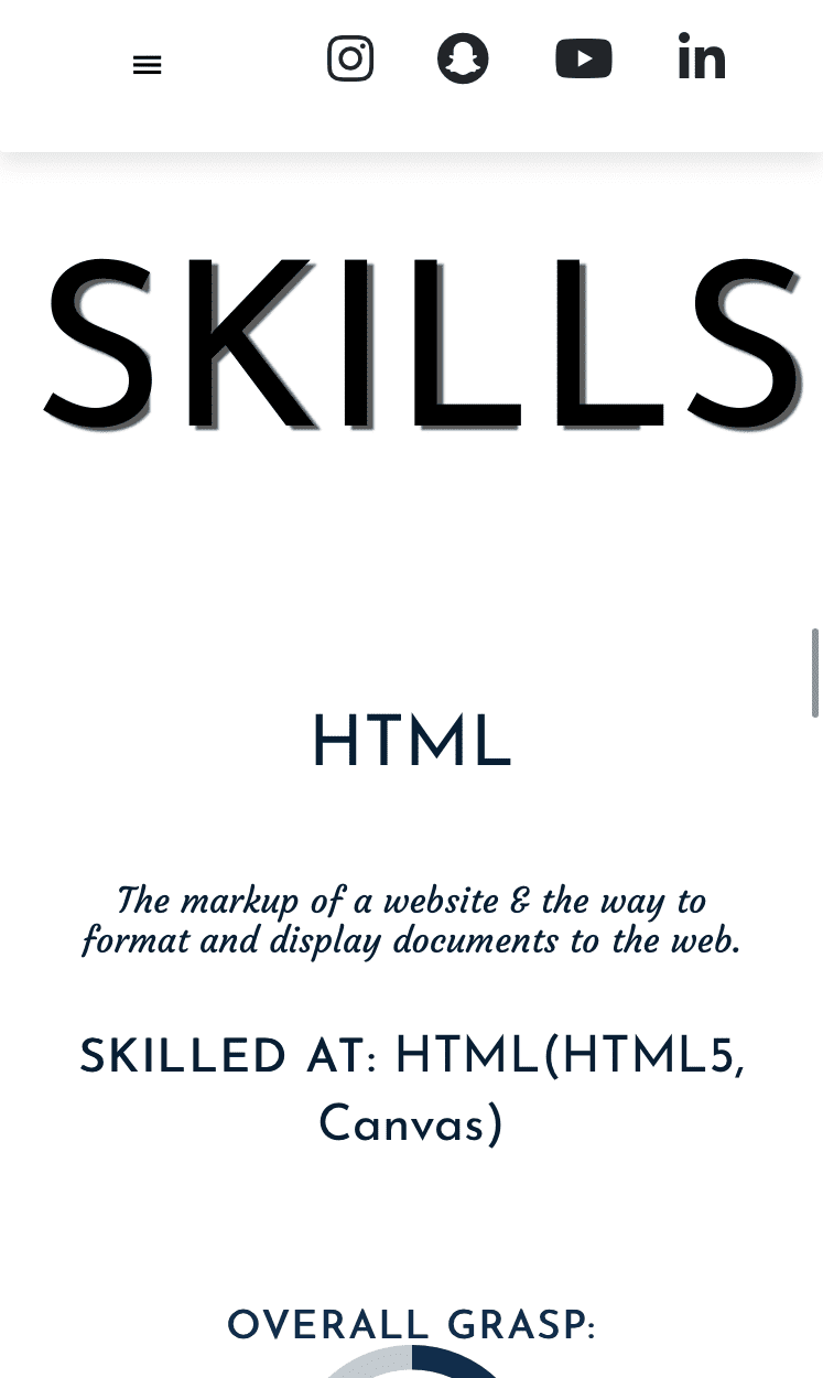
Skills
HTML
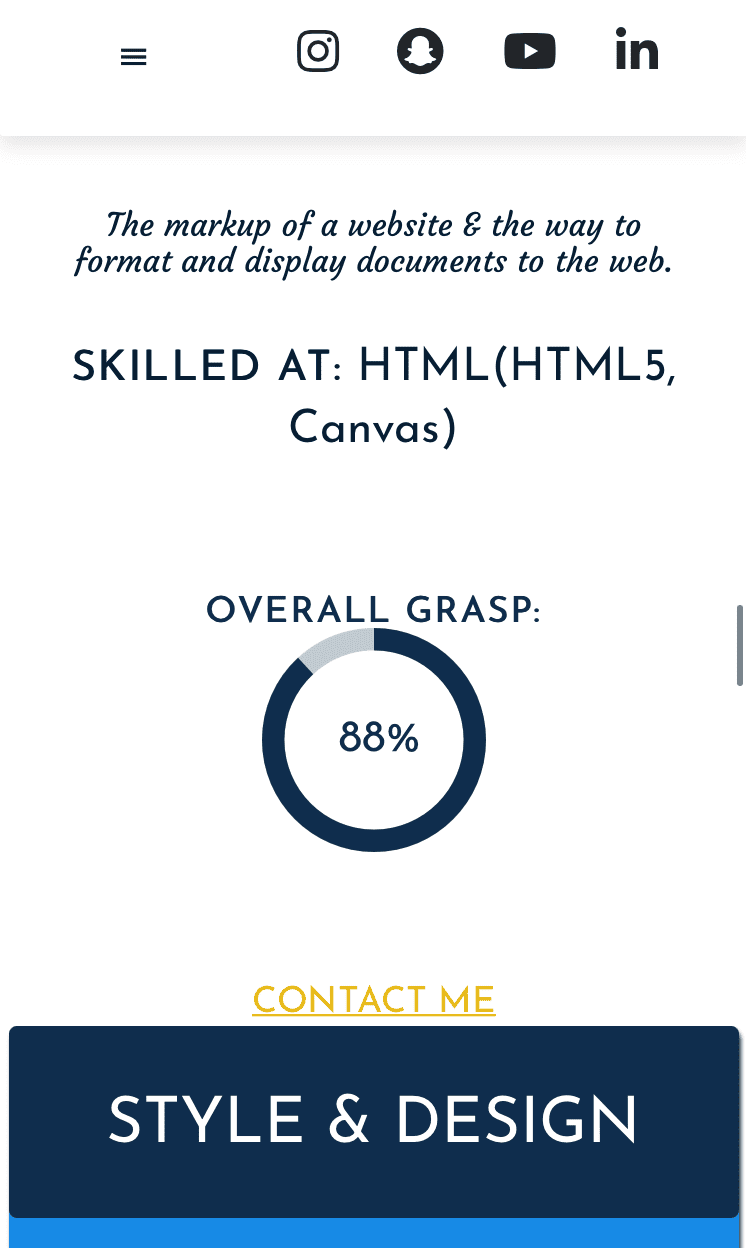
The markup of a website & the way to format and display documents to the web.
Skilled at: HTML(HTML5, Canvas)
Overall Grasp:
Contact Me
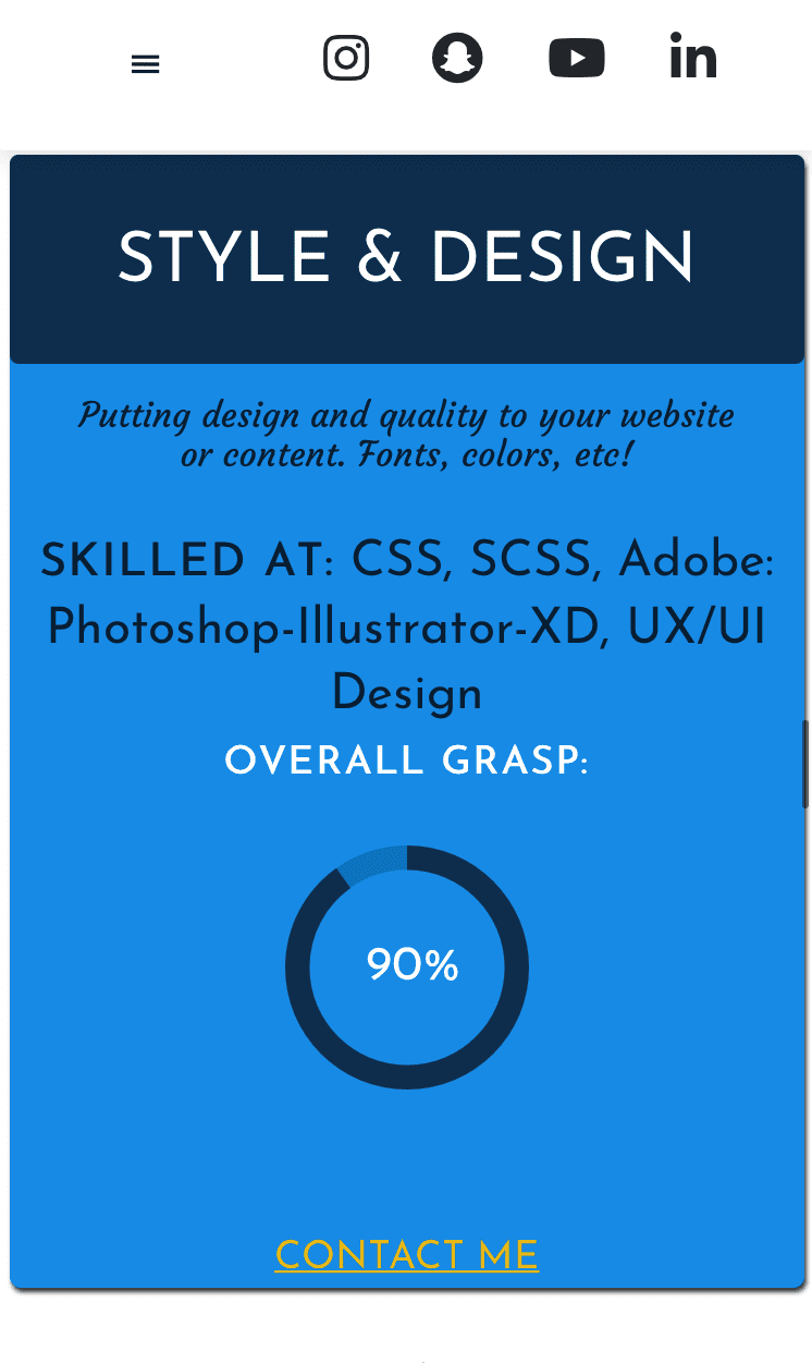
Style & Design
Putting design and quality to your website or content. Fonts, colors, etc!
Skilled at:
CSS, SCSS, Adobe: Photoshop-Illustrator-XD, UX/UI Design
Overall Grasp:
Contact Me
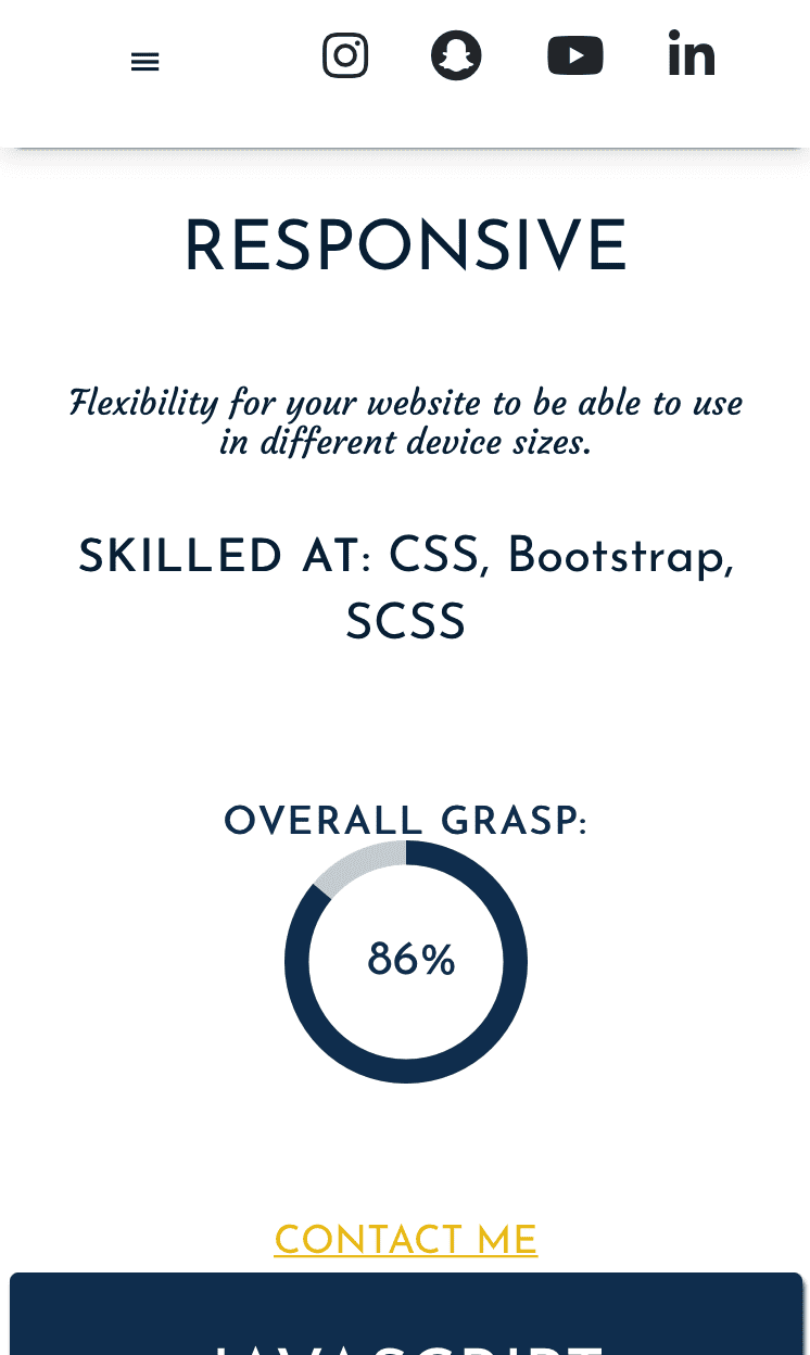
Responsive
Flexibility for your website to be able to use in different device sizes.
Skilled at: CSS, Bootstrap, SCSS
Overall Grasp:
Contact Me
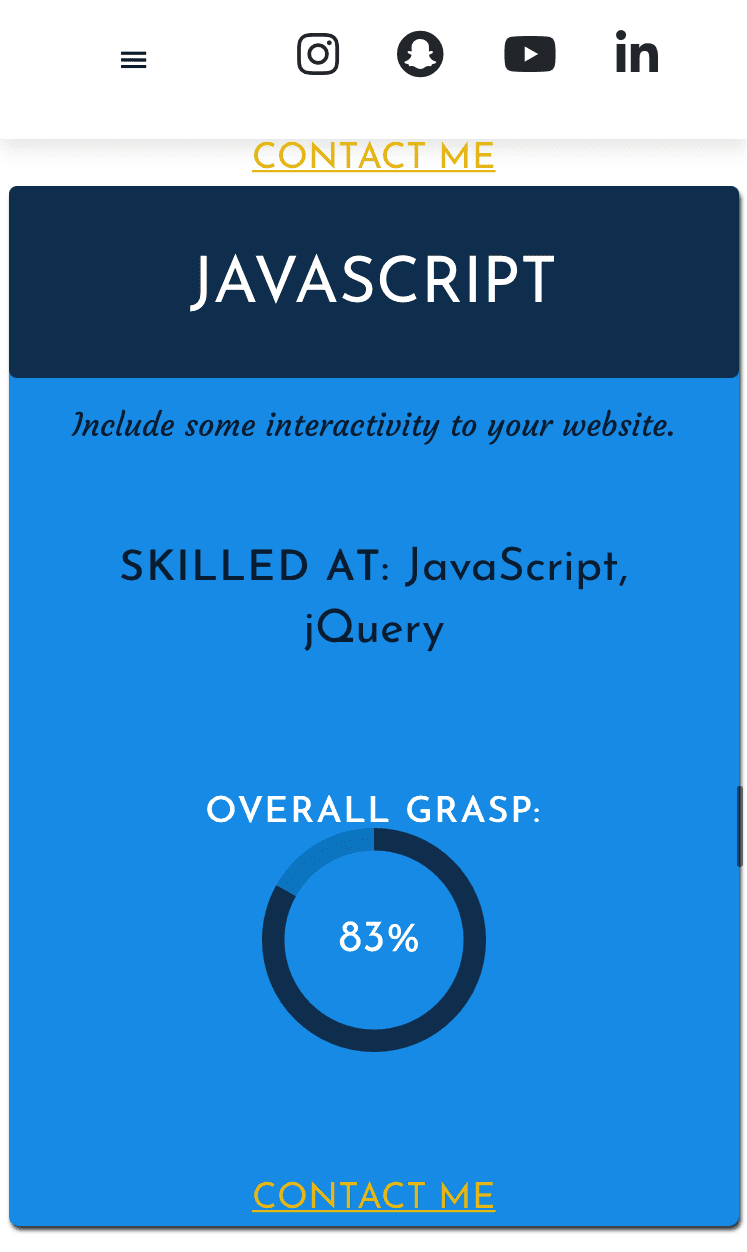
JavaScript
Include some interactivity to your website.
Skilled at: JavaScript, jQuery
Overall Grasp:
Contact Me
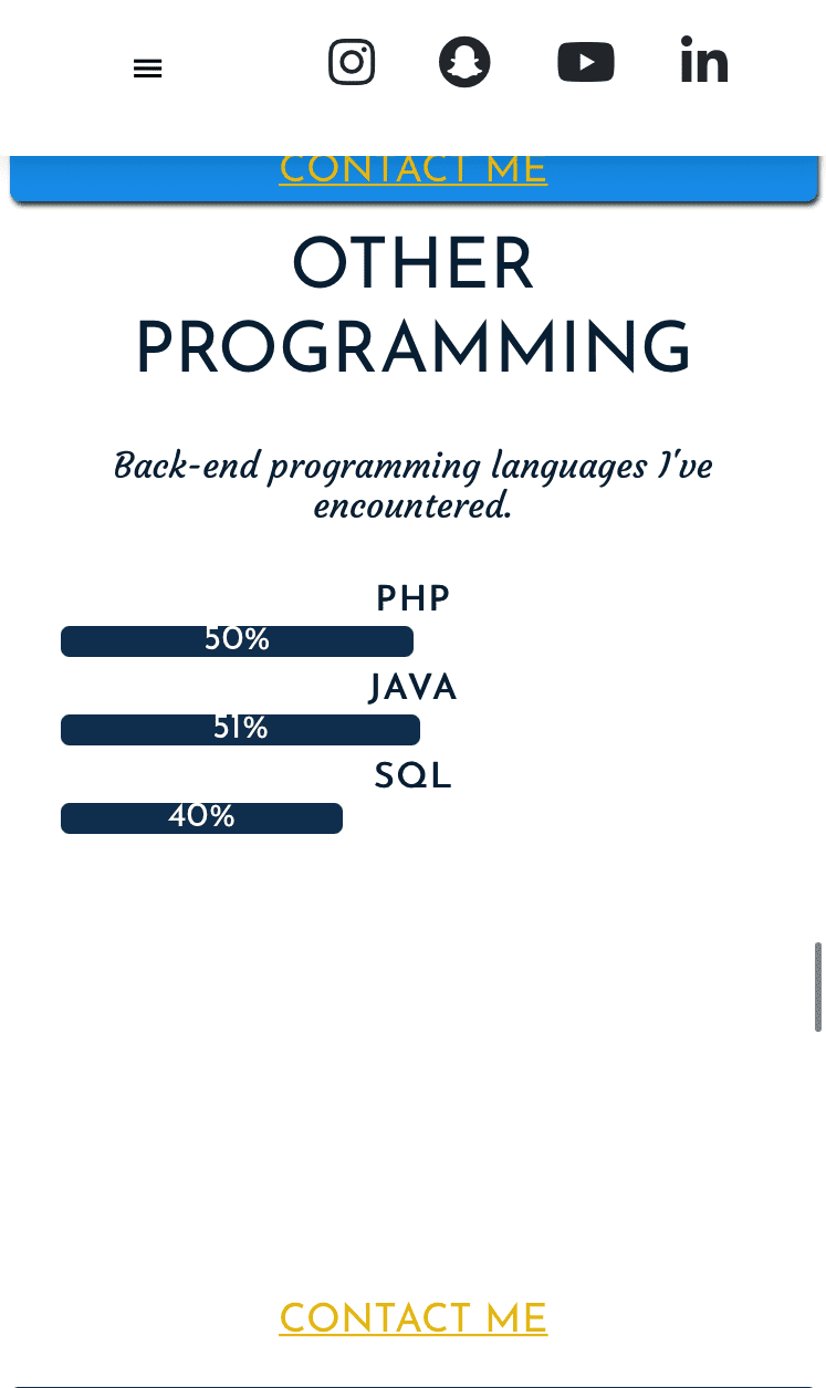
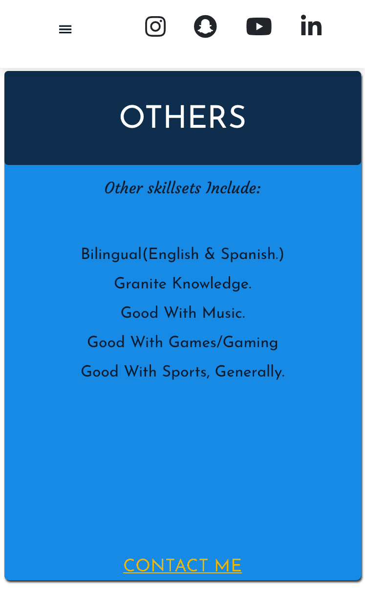
Other Programming
Back-end programming languages I've encountered.
PHP
45%
Java
42%
SQL
40%
Contact Me
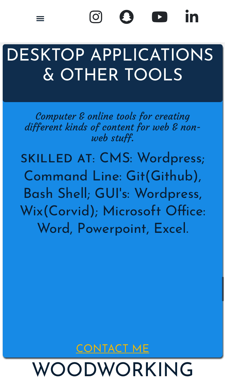
Desktop Applications
& Other Tools
Computer & online tools for creating different kinds of content for web & non-web stuff.
Skilled at: CMS: Wordpress; Command Line: Git(Github), Bash Shell; GUI's: Wordpress, Wix(Corvid); Microsoft Office: Word, Powerpoint, Excel; Others: Spring Boot, XAMPP
Contact Me
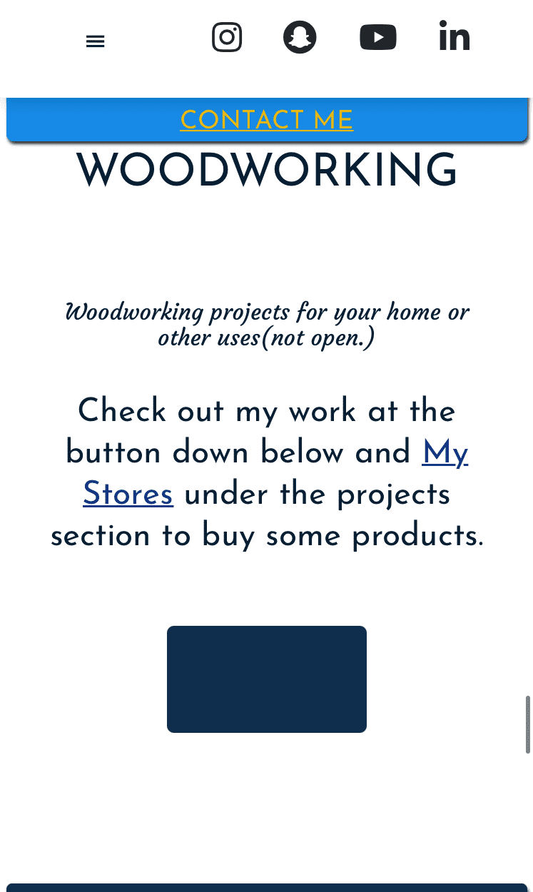
Woodworking
Woodworking projects for your home or other uses.
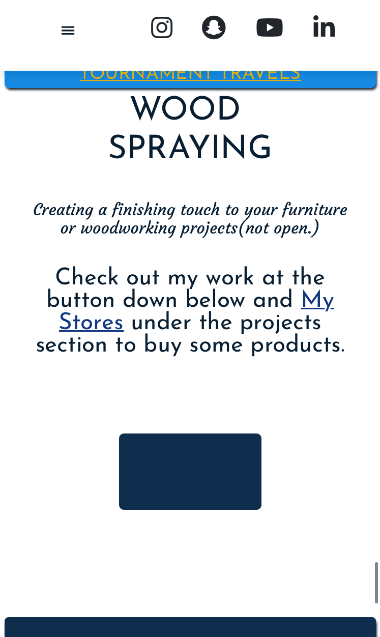
Check out my work at the button down below and My Stores under the projects section to buy some products.
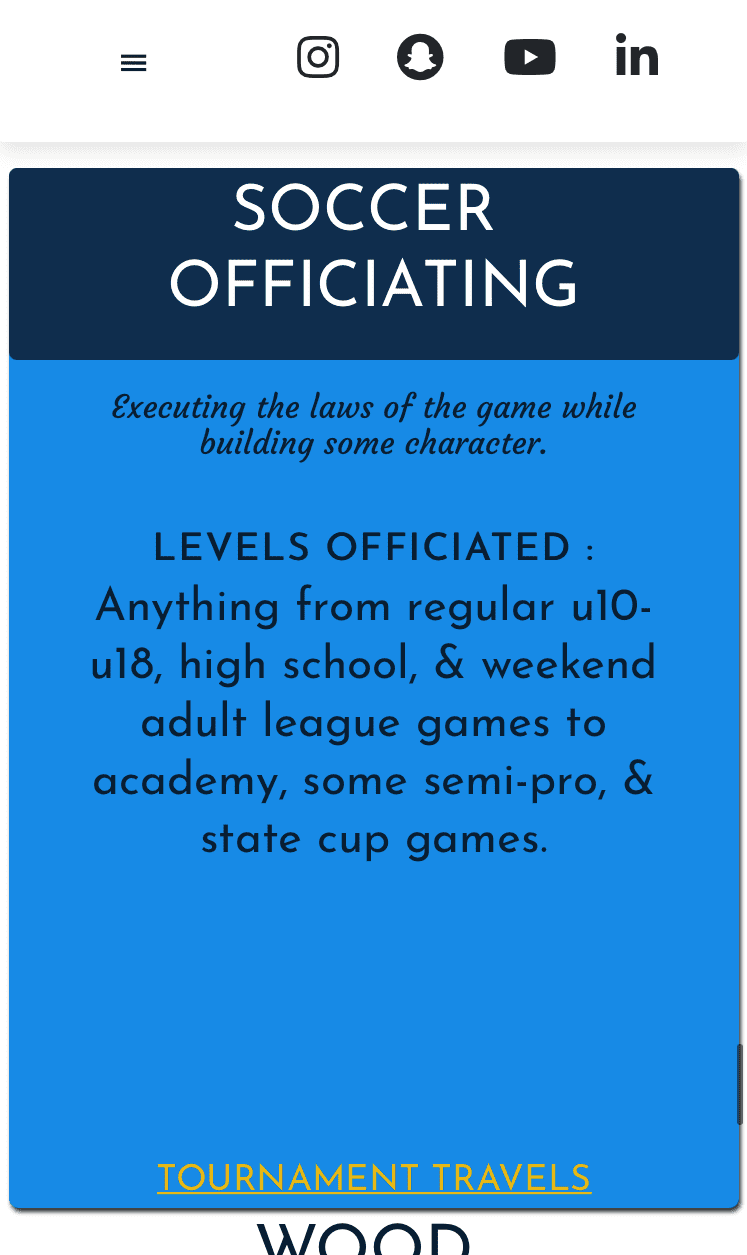
Soccer
Officiating
Executing the laws of the game while building some character.
levels officiated : Anything from regular u10-u18, high school, & weekend adult league games to academy, some semi-pro, & state cup games.
Tournament Travels
Wood
Spraying
Creating a finishing touch to your furniture or woodworking projects.